Aurora

An automotive operating system interface designed for safety & clarity at speed

Aurora hero visual
Date Q1 2026
Length 2 sprints in 8 weeks
Role Project Manager, Head UI Designer, Head Researcher
Tools Figma, Adobe Illustrator, DaVinci Resolve
Key Outcomes Increased safety and entertainment in smart driving experience
Solutions Type Automotive UX
Methodologies Lean UX
Employer/Class IAD 4000, KSU Course

My role & involvement

My role for this project was the project manager and the lead designer. Though I had many responsibilities, my main impact was leading the 5-person team, and designing the HUD & Digital Gauge Cluster.

01

Problem

Digital smartphones cause 70,000 car crashes annually in the United States. Even though phones are prohibited for use while driving, many people are distracted while driving. To name some of the gaps, Apple Car Play and Android Auto force drivers to take their hands off the wheel to interact with their software.

02

Solution Development

Our solution is digital interfaces that are more accessible while driving. These include a Heads Up Display (HUD), Digital Gauge Cluster, and more accessible dashboard.

The five gauge-cluster flows above were the riskiest pieces of the system, so we built them first. If drivers couldn’t read them at a glance or trust the information at speed, nothing else in Aurora would matter. Prototyping the cluster ahead of the HUD and dashboard let us put real interactions in front of users early, pressure-test the interaction model, and decide what to keep, cut, or rework before committing to the rest of the experience.

03

Research

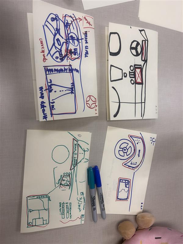
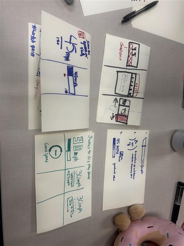
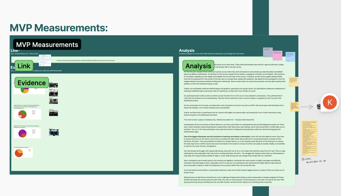
The research followed a Lean UX approach across two sprints, where design decisions were continuously shaped by user feedback. Early on, the team used surveys and interviews to understand what users wanted from dashboard and gauge cluster systems, then created paper prototypes and MVPs to test layout ideas and key features like navigation and safety. As the project progressed, these ideas were turned into Figma prototypes and tested through usability interviews, where participants completed tasks and shared feedback. While users responded positively to the overall layout, testing revealed confusion around navigation, such as closing apps and understanding the home screen. Based on these findings, the team iteratively refined the design by simplifying the dashboard, improving interaction flows, and adding features like a HUD. Each sprint built on the last, creating a continuous cycle of testing, learning, and improving the product based on real user behavior.

04

Lessons Learned

Aurora design system

This project showed me how much a clear design system and a unified team vision carry a multi-person product. A shared design system kept the gauge cluster, dashboard, and HUD consistent as five people worked in parallel, and a common vision for how Aurora should feel behind the wheel made every design call faster and more coherent.

What could be better:

  • Time management for overall projects
  • Scope of project
  • Delegation of work
  • Teaching the group more skills that I know